The Galaxy S8, Samsung made an effort to do something different. It combined everything it did in the past few generations of its phones and added some new ideas to produce something different from everything else on the shelf of the average phone store today.
Of course, Samsung had to do this, because for the past six months it’s been dealing with the biggest public crisis any electronics company has faced in modern times. The Note 7, the last major phone it released, had a crucial design flaw that caused its battery to spontaneously catch fire. Samsung had to recall the phone twice and then was finally forced to cancel the Note 7 entirely.
Now Samsung faces two challenges with the Galaxy S8: create a new phone that will get people excited, and at the same time make them forget about all of those other phones catching fire just last year.
After using both the $720 to $750 Galaxy S8 and its larger sibling, the $840 to $850 Galaxy S8 Plus, for the past week, I can say with certainty that these are phones worth getting excited about. They are easily the best phones released so far this year, and may turn out to be the best phones of the year, period.
They might even be good enough to make you forget all about the Note 7 and its fiery batteries.
Design and Display
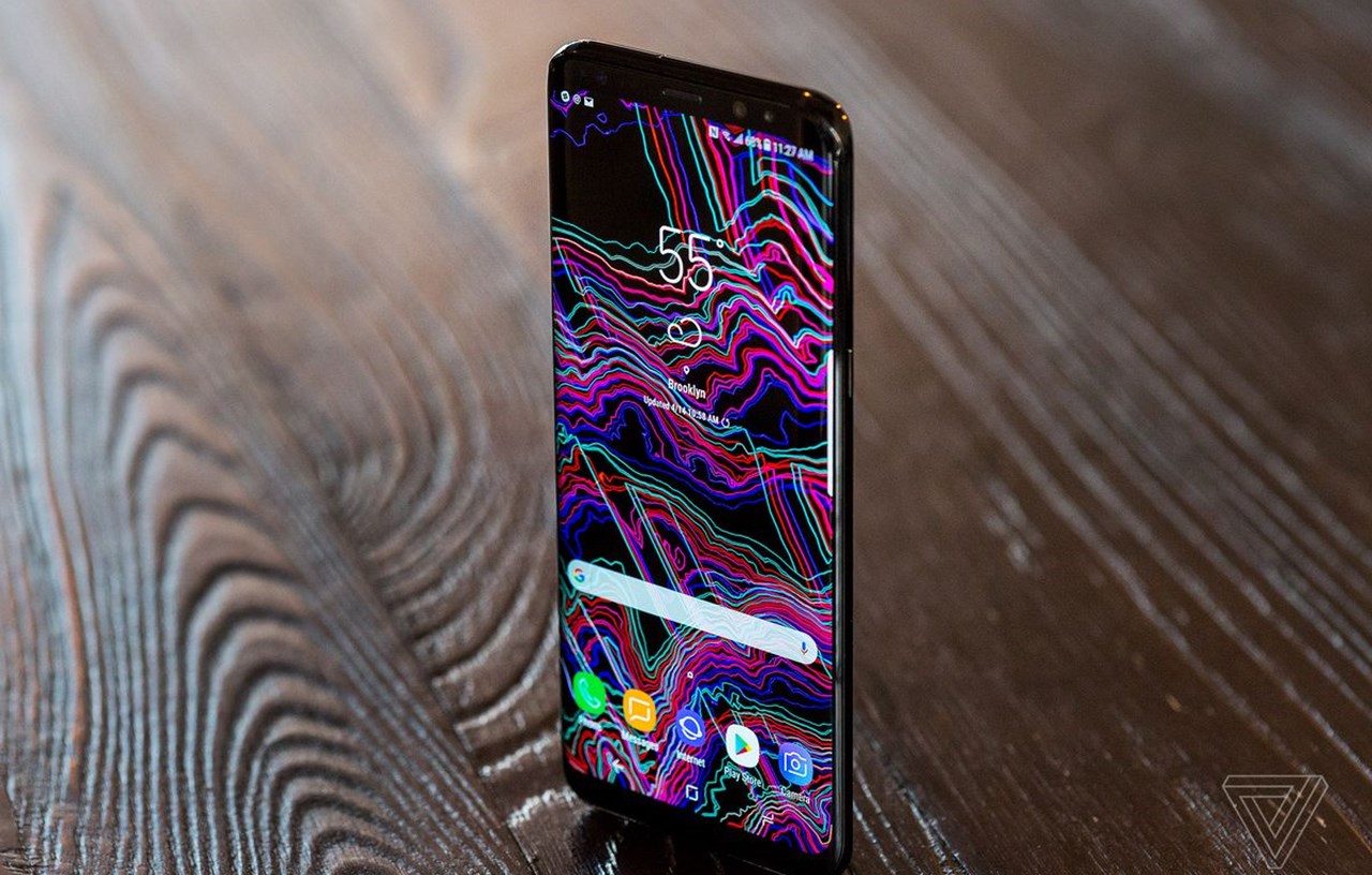
The most common reaction I heard from people who saw the S8 units I’ve been testing is "wow." That’s because the S8 is a stunning device to look at and hold. It truly doesn’t look like any other phone you might have used before, and it’s refined and polished to a literal shine.
The big reason the S8 looks so different from any other phone is its new screen, which Samsung has dubbed the "Infinity Display." It features a new 18.5:9 aspect ratio that’s similar to the 18:9 screen on the LG G6, but taller and skinnier than the traditional 16:9 screens the vast majority of other smartphones have. On the Galaxy S8, it measures 5.8 inches diagonally from rounded corner to rounded corner; on the S8 Plus it expands to 6.2 inches in the same dimension.
The taller aspect ratio means that in terms of raw screen area, the S8 and S8 Plus aren't as big as their diagonal measurements imply. But don't let the complicated mathtake away from the bottom line: they are huge screens in very small bodies. Putting an S8 side-by-side with an iPhone 7 almost feels unfair to the iPhone — the Samsung’s screen is just so much larger, yet the phone’s overall dimensions are practically the same.
That screen is pushed to the outer edges of the phone’s frame, taking up 83 percent of the front panel and leaving very little bezel above and below it. In addition, the sides are curved, finishing off the infinity pool effect and making it feel like you’re holding just a display. Samsung is going all-in on curved screens this year — it’s the company’s big differentiator — and you can’t buy a "flat" version of the S8 at all.
The company’s commitment to curved screens serves both aesthetic and practical purposes. Not only are the curved edges beautiful to behold, they allow Samsung to make the phone narrower than if it had a flat display. A narrower phone is easier to use in one hand and both the S8 and S8 Plus are much easier to handle than other phones with similar-sized displays.
Earlier Samsung phones with curved screens had a tendency to register touches on the sides of the display when you didn’t intend them, making the curved design more frustrating than it should have been. But the company has largely addressed this issue with the S8, as the curves are not as aggressive and the glass blends seamlessly into the metal frame of the phone. I didn’t have an issue with errant touches with either the S8 or the S8 Plus in my time with them.
That new taller and skinnier screen shape does cause some problems, however. I appreciate the narrower width overall, but the height of the screen can make it difficult to reach the notification tray with my thumb, even on the smaller S8. And then there’s the issue of app compatibility. Many apps work just fine on this new screen shape, but a number of popular ones, such as Pocket, Netflix, Speedtest, Dark Sky, and Spotify don’t automatically stretch to fill the screen, leaving black borders above and below the app. You can force these apps to fill the screen with a couple button taps (recent apps, then the circular button that appears on the app in the carousel) and I haven’t seen any issues with most regular apps.
Games, on the other hand, are a bit different. Super Mario Run, for example, does not use the entire screen, and if I force it to, elements will be cut off on the left and right sides of the screen, making it hard to hit some of the buttons in the menus and non-gameplay areas. My colleague Vlad Savov experienced a similar issue on the S8 Plus with Egg Inc. Playing a game in the 16:9 aspect ratio it was designed for is not a terrible experience — you still have quite a large display canvas to play on — but until developers update their apps and games for this new tall and skinny world, you won’t be able to make use of all the screen you’re buying with the S8. Fortunately, Google is encouraging developers to get on board, as it seems like this shape will be popular with phones going forward.
Samsung bills the new aspect ratio as better suited for watching widescreen video, and notes that the viewing area is 36 percent larger on the S8 compared to the S7 playing the same 21:9 video clip. Sure enough, watching the new Star Wars: The Last Jedi trailer on the S8 is an impressive experience, as the content spans edge to edge on the phone’s screen. The S8 can automatically detect 21:9 video and present it as large as it can be without cutting off any of the content, but I only found it working on clips I watched in YouTube. Movies played in Google Play Movies did not automatically use the full screen, though I could hit a button to do so, while video in Netflix remained locked to 16:9 no matter what. As with games, this is an issue that will probably be solved in due time, but if you’re an early adopter of an S8, most of the video you’re likely to watch on it won’t be taking advantage of all the screen has to offer.
Despite those early-adopter issues, I’m a fan of the new shape and the fact that it lets me have a much larger display without making the S8 too unwieldy to use. On top of that, the Quad HD Super AMOLED panel is wonderfully vibrant and sharp, and it’s very bright, even outdoors under direct sunlight. It’s no exaggeration to say this is the best smartphone display I’ve ever seen.
he new screen shape dictates many of the other hardware features on the S8. Because the screen dominates the front of the device, there is no room for Samsung’s traditional home button, so the company followed the path of almost every other Android smartphone maker and utilized on-screen virtual buttons for home, back, and recent apps on the S8.
Samsung also made the area of the screen where the home button appears pressure sensitive, so you can push harder on it to wake the display or go back to the home screen at any point, even in full-screen apps where the home button isn’t visually displayed. It’s not unlike the iPhone’s Force Touch feature, but it’s limited to just the spot where a home button would have been if the screen wasn’t there taking its place. It’s a clever solution and provides virtually the same experience as a physical home button, so longtime Samsung users should feel... right at home with it.
Of course, without a home button, there’s no fingerprint scanner on the front of the phone. Samsung addresses this by putting the reader on the back of the device, which is something Google, Huawei, LG, and others have done for some time. But instead of placing the fingerprint scanner below the camera, near the middle of the phone where your index finger naturally rests, Samsung installed it far up the back of the phone and right next to the camera.
The high placement of the scanner makes it difficult and awkward to reach with my index finger, even on the smaller S8. I have to practically perform finger stretches before I can reach it with any sort of regularity on the S8 Plus. Second, because it is right next to the camera and has a similar shape and feel to the camera module, I frequently touch the camera lens instead of the fingerprint scanner, smearing the lens with all of my lovely finger oils. The placement is a real shame, because otherwise, the fingerprint scanner is one of the fastest and most responsive I’ve used. Samsung has also included Pixel-like gestures on it, so you can swipe down on the scanner to reveal the notification tray, provided you can ever actually reach it.
To make up for the fingerprint scanner’s exceedingly poor placement (Samsung told me that it is where it is because the battery prevented it from being put below the camera), the S8 has two other biometric means of unlocking the phone. The iris scanning that first debuted on the ill-fated Note 7 makes its return, and while I'm sure it's very secure, it’s awkward to use, requiring me to hold the phone uncomfortably close to my face and open my eyes comically wide to trigger it.
New for the S8 is a face-scanning feature that is supposed to be the most convenient method of unlocking the phone. I say "supposed to be" because in practice, it almost never worked for me, despite being very impressive in demos before the phone’s launch. More often than not, the face scanner would not see me at all, leaving me staring at the phone awkwardly, waiting for something to happen, before eventually capitulating and putting my pattern in. Samsung also says the face-scanning feature isn’t as secure as the iris or fingerprint methods, so not only is it slower and less reliable to use, it’s less secure, too.
The new screen shape dictates many of the other hardware features on the S8. Because the screen dominates the front of the device, there is no room for Samsung’s traditional home button, so the company followed the path of almost every other Android smartphone maker and utilized on-screen virtual buttons for home, back, and recent apps on the S8.
Samsung also made the area of the screen where the home button appears pressure sensitive, so you can push harder on it to wake the display or go back to the home screen at any point, even in full-screen apps where the home button isn’t visually displayed. It’s not unlike the iPhone’s Force Touch feature, but it’s limited to just the spot where a home button would have been if the screen wasn’t there taking its place. It’s a clever solution and provides virtually the same experience as a physical home button, so longtime Samsung users should feel... right at home with it.
Of course, without a home button, there’s no fingerprint scanner on the front of the phone. Samsung addresses this by putting the reader on the back of the device, which is something Google, Huawei, LG, and others have done for some time. But instead of placing the fingerprint scanner below the camera, near the middle of the phone where your index finger naturally rests, Samsung installed it far up the back of the phone and right next to the camera.
The high placement of the scanner makes it difficult and awkward to reach with my index finger, even on the smaller S8. I have to practically perform finger stretches before I can reach it with any sort of regularity on the S8 Plus. Second, because it is right next to the camera and has a similar shape and feel to the camera module, I frequently touch the camera lens instead of the fingerprint scanner, smearing the lens with all of my lovely finger oils. The placement is a real shame, because otherwise, the fingerprint scanner is one of the fastest and most responsive I’ve used. Samsung has also included Pixel-like gestures on it, so you can swipe down on the scanner to reveal the notification tray, provided you can ever actually reach it.
To make up for the fingerprint scanner’s exceedingly poor placement (Samsung told me that it is where it is because the battery prevented it from being put below the camera), the S8 has two other biometric means of unlocking the phone. The iris scanning that first debuted on the ill-fated Note 7 makes its return, and while I'm sure it's very secure, it’s awkward to use, requiring me to hold the phone uncomfortably close to my face and open my eyes comically wide to trigger it.
New for the S8 is a face-scanning feature that is supposed to be the most convenient method of unlocking the phone. I say "supposed to be" because in practice, it almost never worked for me, despite being very impressive in demos before the phone’s launch. More often than not, the face scanner would not see me at all, leaving me staring at the phone awkwardly, waiting for something to happen, before eventually capitulating and putting my pattern in. Samsung also says the face-scanning feature isn’t as secure as the iris or fingerprint methods, so not only is it slower and less reliable to use, it’s less secure, too.
Aside from that major stumble, the rest of the S8’s hardware is practically flawless. The fit and finish is unparalleled, and the curved display is matched by a symmetrically curved back glass panel. All of this glass does make the phone a bit of a fingerprint magnet, and it’s going to be more prone to scratching and damage than an all-aluminum phone. But the glass back allows for Samsung’s wireless charging, and like last year’s S7, the S8 is water resistant to IP68 standards, so it can withstand 1.5 meters of submersion for up to 30 minutes at a time. In practical terms, that means you don’t have to worry about your phone getting ruined when one of your tipsy friends spills their beer all over it at happy hour.
The S8 and S8 Plus use USB Type-C ports for wired charging and data transfer, and both phones include a standard 3.5mm headphone jack. Samsung is also throwing in a set of AKG-branded wired headphones with the S8 models (the company recently purchased AKG’s parent company, Harman), which sound fine. They are better than Apple’s EarPods by a good mile, and are comfortable and easy to wear. But the headphones are more like a nice bonus than a reason to buy the phone, and they are certainly not worth the $99 Samsung claims they are.
Overall, apart from the fingerprint scanner, the theme of the S8’s hardware is polish, both literally and figuratively. It’s a glossy, metal-and-glass monument to Samsung’s manufacturing capabilities, and it’s just really, really nice.
Software
Software is where Samsung is known less for polish and more for clumsiness. In a refreshing change of pace, the software on the S8 is, dare I say, good. It’s not perfect, but it doesn’t send me running to the Play Store for a new launcher and icon pack the instant I turn the phone on.
Built on Android 7.0 Nougat, the S8’s software is remarkably restrained for Samsung. This is reflected by the simple home screen, which features just a handful of app shortcuts and a nice big weather widget front and center. A quick swipe up and I’m in my app tray, a swipe up again and I’m back to the home screen.
The settings menu is similarly straightforward and easy to navigate, and includes a search function to find anything within it. Should you dig deep into the settings, you can find an endless array of options and configurations, from customizing the order of the on-screen buttons to themes that can alter the appearance of virtually every aspect of the phone. (There are plenty of Pixel-style themes already available if you aren’t a fan of Samsung’s default color palette.)
Other touches, like the slick, pill-shaped notification bubble that pops up at the top of the screen when an alert comes in, or the customizable always-on display are things I wish were available in all versions of Android, not just Samsung’s.
The big new software feature for the S8 is Samsung’s riff on a virtual assistant, called Bixby. Samsung thinks Bixby is so important to this device that it put a dedicated button on the side of the phone that only launches Bixby. That would be fine if Bixby was anything to get excited about, but in its current state, it doesn’t do much at all.
Pushing the Bixby button twice will launch Bixby Home, a home screen panel that displays various cards and information based on your routines and interests. It can plug into third-party services such as Twitter, Facebook, Spotify, and Foursquare, and can tell you the weather, upcoming appointments, news updates, or reminders you’ve set. Unfortunately, none of this is hugely different from what we’ve seen from Google, HTC, and others doing on their home screens for years. Samsung says Bixby is designed to learn your habits and will adapt over time, but it’s likely that I haven’t been using the phones long enough for this to take measurable effect, because I haven’t really seen much in the way of personalization.
Bixby also shows up in the camera and gallery app, providing functionality that’s very similar to what Amazon already offers in its app and what Google Goggles has done for years. Called Bixby Vision, it uses computer vision to identify an object or text and then links you to similar images on Pinterest or options to buy more of the same product from Amazon. It uses Google Translate to translate text, much like how the proper Google Translate app does. It can also identify landmarks and provide links and facts about them or tell you all about the bottle of wine you’re about to open.
I pointed the S8’s camera at a banana and launched Bixby Vision and a few seconds later, it provided me with a list of ways to buy more bananas from Amazon. It did the same for a bag of Tostitos chips. Pointing Bixby Vision at a succulent led me to a list of images of similar plants on Pinterest.
All of that is exactly what Samsung says Bixby Vision would do, but I’m struggling to figure out just why I’d ever use it for these features. It’s often just quicker to search Amazon directly for the product I want or use Google to find images of something.
Bixby’s real promise is that it will be a new kind of voice assistant, one that will help you do things on your phone quicker and easier. But Bixby’s voice features are not available on the S8 yet, and I have not been able to test them. Samsung says that voice control will arrive "later this spring," but has not put a firm date on when exactly that is.
Adding insult to injury, it’s not possible to remap the Bixby button on the S8 to do something more useful. (I was unable to get this hack working on my T-Mobile review unit.)
Some of Samsung’s bad software history shows up in other ways on the S8. The company has been criticized for years for duplicating many of the same apps Google offers, and the S8 has many redundant apps. I’m of two minds about this: believe it or not, some of Samsung’s apps are actually better than Google’s (I’ll take Samsung’s faster, more extensible browser over Google Chrome any day of the week, and Samsung Pay has legitimate advantages over Android Pay), but many are not. I certainly don’t need two app stores, two email clients, or two gallery apps on my brand-new phone. A simple solution to this would be to let me choose which versions I want, by either adding a step during setup or letting me fully uninstall the unwanted apps, but neither option is available. (You can disable the apps you don’t want, but you cannot fully remove them from the phone.)
On top of all that, my T-Mobile review units include six more preinstalled apps, the worst of which is the insidious and useless Lookout security app that pops up a notification every time you install a new app until you dig into its settings and turn it off.
I will note that these things don’t completely ruin my experience with the S8, and many of them are easy to live with or ignore. The forthcoming unlocked version should address the carrier app issue, at the very least. But the S8 would be even better if it didn’t still have these annoying software problems.
Performance
Unsurprisingly, the Galaxy S8 and S8 Plus have a veritable murderers’ row of specs and features on the inside, some of which are so forward-looking you can’t even take advantage of them yet (and I was unable to test). The models sold in the US and a handful of other Western markets are the first phones to feature Qualcomm’s Snapdragon 835 processor, while the rest of the world gets Samsung’s own similarly equipped Exynos processor. Either processor makes the S8 fast and responsive, but so is virtually every other premium phone you can buy, and the S8 isn’t noticeably faster or quicker than a Google Pixel, LG G6, or iPhone 7. The big question is how fast will the S8 be after a few months of use, as Samsung phones are notorious for slowing down over time, but I can’t answer that yet.
That processor is paired with 4GB of RAM, 64GB of internal storage, a microSD card slot for expansion, and a radio capable of both gigabit LTE and gigabit Wi-Fi. The S8 is the first gigabit LTE smartphone you can buy, but until we have actual gigabit networks to use it on, that doesn’t matter all that much. (US carriers are expected to deploy their first gigabit networks before the end of this year.) The S8 is also the first phone to come with Bluetooth 5.0, which promises better range and the ability to deliver audio to two different Bluetooth devices at the same time. I was able to get the same song from YouTube to simultaneously play out of two sets of Bluetooth headphones, though you could also use it to have two Bluetooth speakers play the same audio.
One spec that hasn’t changed since last year is the S8’s main camera, which is a 12-megapixel sensor behind a f/1.7 optically stabilized lens setup. Samsung has beefed up its software processing, using similar techniques as Apple and Google to provide better detailed images in low light, but the differences between this year’s camera and last year’s are negligible at best.
That’s not a bad thing at all, as the S7 had one of the better cameras you could buy in 2016. The S8 continues that, and is capable of taking tremendous images in both good and poor lighting. The camera opens very quickly (double tap the power button to open it from anywhere), it focuses exceptionally fast, and is able to balance tricky exposures well. A backlit portrait of my young daughter that tripped up the iPhone 7’s metering system was handled by the S8 just fine, producing an image with a bright face and evenly exposed background, compared to the darker, flat picture the iPhone took.
Samsung’s camera app is simple to use, yet loaded with powerful features if you want them. It’s easy to use one-handed, as you can drag the shutter button left or right to zoom in or out or swipe up or down to switch between front and rear cameras. Various filters and manual controls are a horizontal swipe away — including Snapchat-like lenses built right into the camera app, which are simultaneously terrifying and endlessly fun.
The front camera did get a hardware improvement, stepping up to a higher-resolution 8-megapixel sensor and gaining autofocus, which is apparently something that front-facing cameras have always lacked and nobody realized it. Autofocus is great, it ensures that your face is in focus whether you’re taking a solo selfie close up or putting the S8 on a selfie stick to capture an entire group. If anything, this year’s camera updates speak to how important the front-facing camera is at this point, as it’s frequently used more often than a phone’s rear camera.
While Samsung loaded the S8 up with forward-looking specs and hardware, it (understandably) was more conservative with the batteries inside the phones. The smaller S8 has a 3,000mAh battery, while the S8 Plus jumps to a 3,500mAh cell. Both of those are actually smaller in capacity than the battery in last year’s S7 Edge, but Samsung says they feature a new design that allows them to maintain their charge capacity for much longer than older batteries. That means that two years from now, the S8’s battery should still provide 95 percent of its stated capacity. Of course, I have not been able to test this claim.
I did test the battery life between charges and found the S8 to be on par with last year’s S7, while the S8 Plus provided about the same stamina as the S7 Edge. The smaller model can last an entire day between charges if you’re a light user, but if you use your phone a lot, you will likely have to charge it at some point in the day. The larger S8 Plus might be the better option for heavy users — it was more likely to last me a full day before it needed to be plugged in. Both phones include fast wired and wireless charging, which makes it convenient to charge them when necessary, but neither really pushes the boundaries of smartphone battery life as we know it.
Many people simply want to know if these phone’s batteries will succumb to the same issues as the Note 7’s, and to be perfectly honest, I don’t know if that will be the case or not. However, I’d be surprised if they did catch fire — Samsung has put a lot of time, money, and effort into making sure the S8’s battery is safe, and if the Note 7 situation were to repeat itself, the company would be facing a death sentence in the court of public opinion.
That court of public opinion is extremely important to Samsung, as it tries to move out of Apple’s shadow and stand out on its own.
Luckily for Samsung, the Galaxy S8 and S8 Plus are excellent devices to begin the work of rehabilitating its image. They are the best Android phones you can buy right now, with stunning displays, beautiful design, and great performance.
They aren’t perfect, though. There are few things that might make you think twice about upgrading, such as that terribly placed fingerprint scanner and only average battery life. But the shortcomings, as notable as they are, are far outweighed by achievements like its toweringly large screen and reliably good camera. I wouldn’t hesitate to recommend these phones to anyone in the market for one.
There's an irony in Samsung's fundamentally iterative design: it's so very well executed that it has a chance to win over people who "aren’t excited by new phones anymore." Overall, the S8 is a relatively conservative and predictable device — anyone that has been paying attention to Samsung’s designs over the past couple of years could see that this is where the company was headed. But it did take risks by pushing forward with an unproven screen shape and going all-in on curved designs, which haven’t been universally liked in the past.
Now it just has to hope those risks doesn’t literally blow up in its face.





Comments