New lists of UI/UX design trends appear every year, as is the way with trends. But there’s a reason for that. When the majority of players start to follow this or that trend, it inevitably becomes ineffective because of the oversaturation. So the way out for designers is to actually check them out from time to time to offer something new for the clients, while for business owners it’s a source of ideas for their brand’s development.
Having 10+ years of experience with web and mobile app design, we know how to use UI/UX trends to design visually pleasing and effective digital products for any industry. So we prepared a list of UI/UX design trends that will shape 2021 along with the possible challenges. Make the best of the UI and UX design best practices and create strong and capable products that pay off.
#1 All things remote and virtual
2020 has been a year no one could’ve predicted. All remote aspects from working from home to the new wave of virtual reality were among the main design trends of 2020 and it will remain so in the coming 2021 and beyond. AR and VR have already paved their way into healthcare, education, and art by leaps and bounds in early 2020, out of necessity. While it’s a fact that many companies tried to make it a thing in the past and failed, the thing is, it was never quite what we thought it could be. The pandemic was a thing needed for society to stop perceiving these technologies as being for entertainment’s sake only.
Shares of Zoom have gone by 600% in a year. Along with similar tools, it’s now in hot demand and it looks like in the future the things will further develop in magnitude leading to the creation of full-blown “virtual office” ecosystems. We’ll soon see more corporate meetings in VR. You don’t even have to have a headset and goggles to participate anymore. Take a look at how the virtual-reality workspace startup Spatial presents it:
The world has already been moving in a remote direction during the last 15 years or so. The virus just gave it a kick, cramming what was going to take 10 years into the 6-month time.
In the new realities, the format of interactive pitch decks has been resurrected. Now it’s the norm to tell about the results of the project, a new idea, or present a design on slides in Zoom/Skype. Or use a bit more advanced approaches. Last year, a presentation startup Pitch raised an extra $30 million in funding.
There are also tons of content made for VR on Youtube. Facebook is getting more serious about VR and AR. There are interactive VR travel apps, apps for creating three-dimensional works of art, AR apps for interior design and museums, educational VR games, and more.

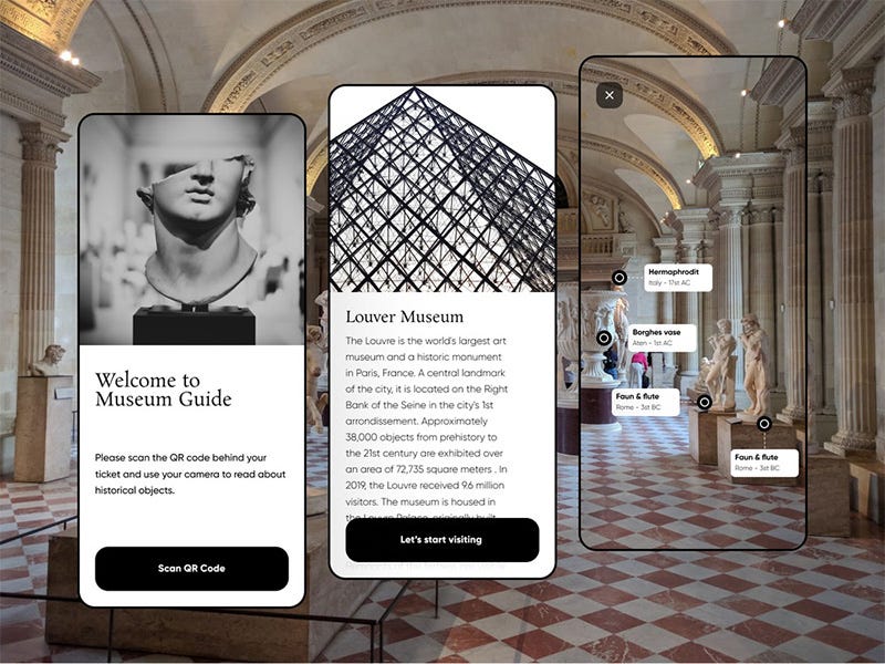
More and more companies are thinking about solutions to integrate VR and AR into their digital products. If the new VR wave takes off, we’ll be looking at a quite exciting time for designers soon with completely new opportunities to market products and services.
At the same time…
Because this design trend still feels new, there is a certain lack of augmented and virtual reality design and development standards which are still under construction. And the absence of a common language makes the development process much slower while also being a reason for the challenges with different AR/VR project compatibility. Yet, it’s only a question of time.
Remote collaboration is another challenge associated with the remote in general that designers and managers face in case they didn’t have prior experience. Chances are, at this moment in history you already know the common tricks that help. Still, you can always check out this guide to remote work for designers. Dozens of useful tips to improve your efficiency with real-life examples from well-known companies there.
#2 AI and other tools to the rescue
Generally speaking, all modern interface design and development tools focus on several important aspects:
- Fighting against routine
- Bridging designers and developers
- Comfortable work with design systems
- Remote and collaborative work online.
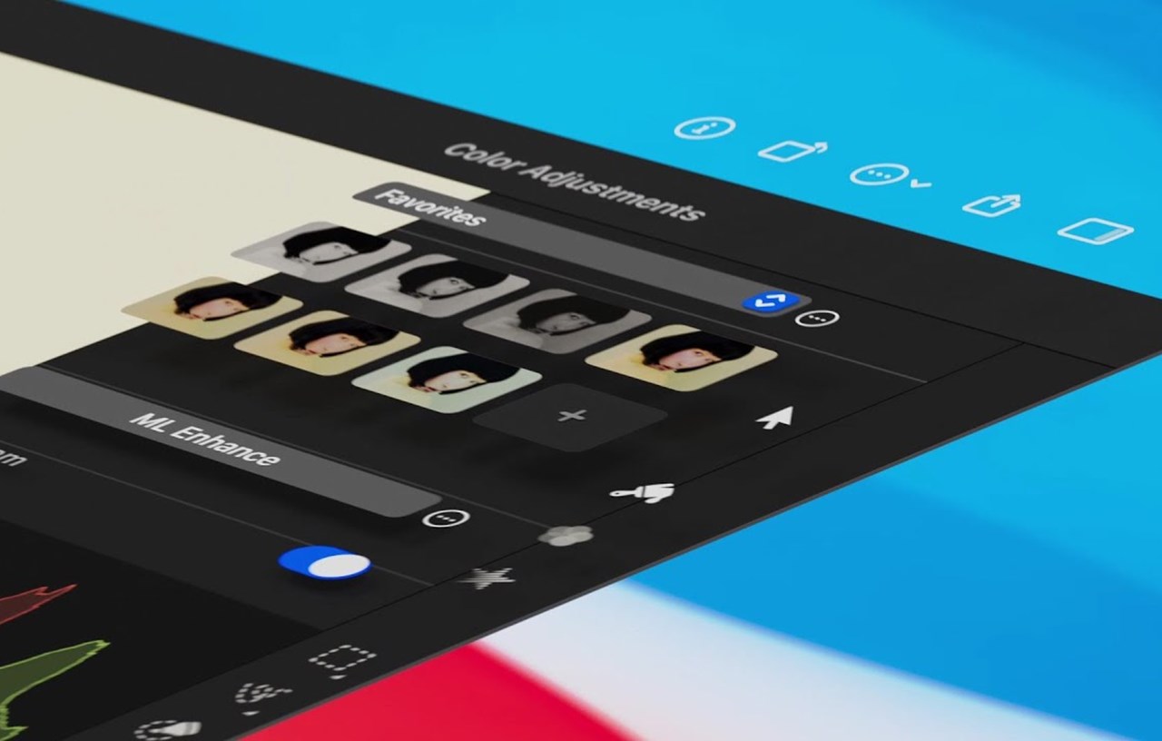
All of the above sort of form one of the current trends in user interface design — easing the designers’ workflow with the help of modern tools and technologies. For example, Adobe announced in October their update to Photoshop version 22.0 that includes many insanely awesome AI-powered features from Nvidia, a set of image editing tools that Adobe calls “neural filters” among them. Color Variables and Components View are new features in the Sketch App. They make it easier to keep the color consistency and work with components. Figma hastened to add new features for distributed teams that make remote collaboration even easier, including templates and virtual meeting features. The latest update to the graphic editor Pixelmator features machine learning-enhanced and GPU-powered image editing.
Another potentially promising UX/UI trend is the generative design. This is the name of programs that can analyze a large array of similar data, find their defining features and characteristics, and then create new ones based on the provided data.
For several years now, the analyst firm Gartner has been releasing a report called Hype Cycle for Emerging Technologies where their employees tell what technologies have the greatest potential for development in the coming years and why investors will be attracted to them. This year, there’s a lot about AI there, including generative design. The first example of such AI that comes to mind is the infamous Deepfake. But you can find a more innocuous well-known one — the This Person Does Not Exist project. Both are created using the GAN (generative adversarial network). Now the quality of deep fakes is such that fraudsters are using them which means that both private individuals and government agencies are interested in their quick recognition. Which means they’ll become even more sophisticated… And so on. So, in the near future, according to Gartner forecasts, generative AI will develop rapidly.
In UI/UX design, there are already dozens of algorithm-driven design tools that you can use in more practical ways: to create layouts and marketing materials, check all possible principles of the basic rules, choose visual styles, and generate presentation mockups and small design details that have completely disappeared from the design, partly because of the popularity of minimalism, and partly because of the designers’ desire to avoid overburdening themselves (or more likely because of the desire to do things faster and cheaper), accessibility check, etc. In essence, tasks that take a lot of time and a minimum of creativity. In fact, the designer becomes the controller of the result of the neural network settings. Discover this amazing list of AI design tools collected by Yury Vetrov, the Director of Brand Management and Digital Customer Experience at Raiffeisen Bank Russia.
At the same time…
AI and its capabilities in UI and UX are still in the nascent years of their development. AI requires fine-tuning to become effective. Machines teach each other, but they are still far from thinking on their own and competing with humans in the matter of taste and deciding on what is relevant and appropriate and what is not. AI’s purpose is to help and assist people with their tasks which they show great results in already.
#3 Advanced personalization
Personalization in design is an approach where a company or brand creates individual content and recommendations for each user based on provided information: date of birth, marital status, viewing and order history, etc. The main goal of personalized design is to make the user feel that the content is created especially for them and in this manner increase the conversion rate which is what all the commercial website owners strive for.
Personalization is as much a user experience trend as it is one of the best practices nowadays. Google and Apple continue to develop personalized assistants for their ecosystems that can now understand who is interacting with them by voice, face, or fingerprint. In the future, interfaces will become even more personalized and change their appearance, position of elements, tone, and behavior in general in a blink of an eye.
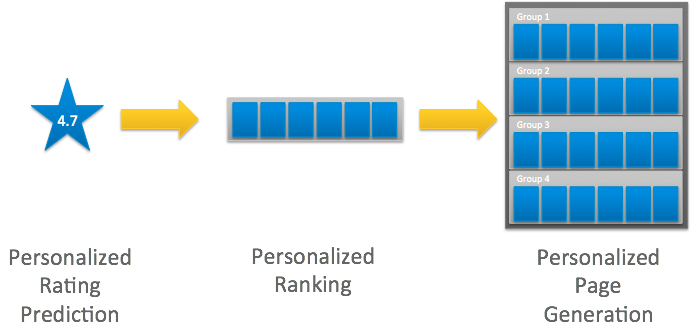
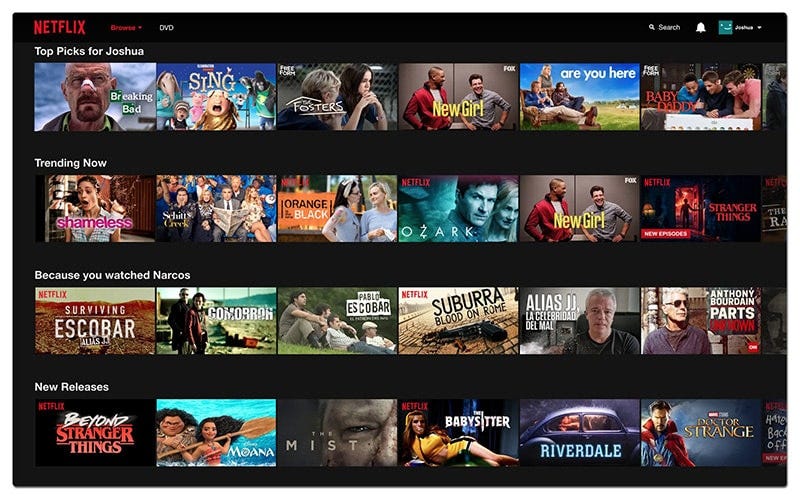
AI plays a big part in UX without the majority of users even realizing it. Think about the personalized music suggestions on Spotify. The suggested videos on Youtube or Netflix recommendations. Amazon creates a personalized homepage for each of its customers based on their shopping habits, wishlist, and shopping cart. You can make the interface more personal to the user by generating content that is relevant to them.


At the same time…
Personalization is not an easy design tendency to follow. It’s not about letting a user switch between dark and light themes (which is more of customization). Sites may collect and analyze data incorrectly resulting in bad outcomes. Call a user by the wrong name or suggest something that will offend them and you lose them forever. Building a personalized website is expensive. You have to collect and analyze information, develop profiles and personal accounts, and ensure the work of algorithms to create individual interfaces. Many users find it intimidating that the site knows specific information about them, so the personalization also requires better security and improved UX writing to convince a user to provide their personal information, etc.
#4 Touchless interactions
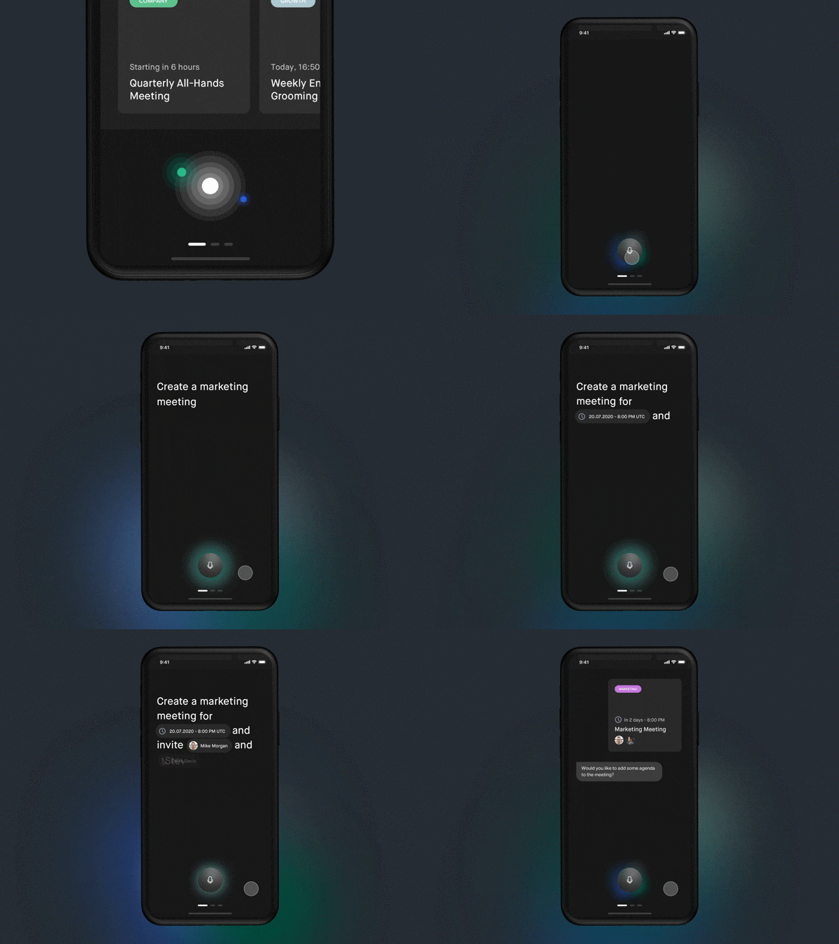
Another UI and UX trend that began anew in the wake of the pandemic. We are talking about the various methods of interacting with devices without actually touching them such as VUI (voice user interfaces) and air gesture control.
Even before the pandemic, it became clear that the voice interactions are one of the major UI/UX trends of the years to come (we listed voice UIs among the design trends back in 2019). Adding a voice-user interface to your design can expand its reach. For example, you can use voice chatbots for visitors to communicate using voice commands. The same applies to virtual assistants. In the next few years, many companies will create complete voice user interfaces.

Air gesture control is a technique that takes various gesture control mechanisms that were introduced with the advent of touch screens to a new level. Now movements in the air make things work on the devices. For example, recently DS Automobiles, a European luxury car brand, showcased their new contactless controls through mid-air haptic feedback and gestures, claiming that the system offers three times greater accuracy than touchscreens:
At the same time…
Voice search is different from the usual one. Sometimes users can’t formulate clearly enough what they are searching for. Nuances of language, loss of context retention with incomplete tasks, speech impairments, inability to understand at a glance what a voice interface is at all capable of — all this affects the VUI design.
As for the air gesture controls, there are some challenges involved with the phones. Sometimes it’s harder and slower than the usual way, inconvenient, not private enough. But you can find it very useful with the TV, while driving, or cooking with recipe apps. Last August Apple was awarded a patent that describes some of the cool features we could see in future AirPods Pro models, including the ability to control the wireless earbuds with “in-air gestures”.
#5 (Even more of) 3D and immersive experiences
3D designs have been attracting users for years now so you can hardly call it a novel design trend, both on the web and on mobile. But this year, the designers’ interest in 3D components and entire 3D scenes in interfaces will go even higher.
3D design got a new boost with Apple incorporating it in their new recently released macOS update. macOS BigSur has a set of revamped icons some of which look rather 3D-ish:


What has also changed is that whereas before the 3D elements were not diverse in practical use because they often dumped a very heavy load on user machines and were not in such a demand, modern front-end frameworks and libraries are able to significantly reduce page load time allowing the 3D objects to become even more detailed and larger.

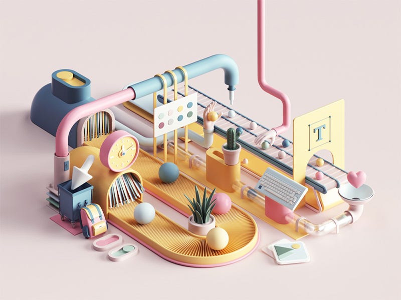
In 2021 the 3D will only continue to become more popular, especially seeing the rising popularity of VR and AR technologies. Cool abstractions, unusual angles, you can do all this in 3D without using real objects, which often saves money, for example, when you need to present an expensive car or an unusual house. 3D attracts attention and makes websites more appealing making users stay on the page longer and increasing session time.
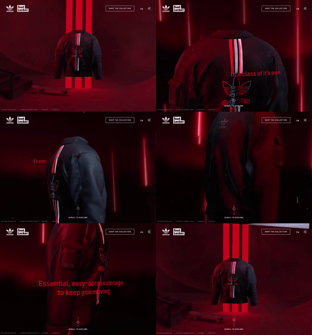

The popular three.js JavaScript library was used for 3D rendering and UI interactions of this website:

At the same time…
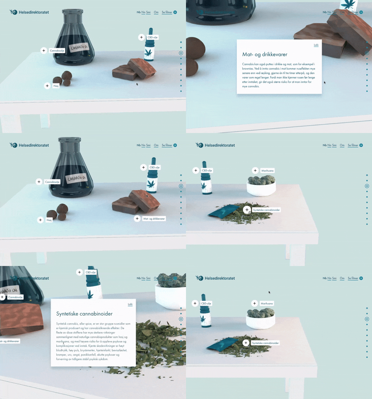
Technologies evolve, but the main drawback of 3D remains. The more complex graphics are, the more load they execute on user machines. It’s imperative that you only use this tool if you are confident that the website is optimized enough to display a heavy 3D animation. Otherwise, users will encounter lags and freezing of pages. This trend is in full swing and will be fully formed a little later. So ideally, it’s best to order custom graphics from designers who know how to optimize them for your purposes.
#6 Motion that users love
Users of all ages and generations like to watch engaging animated stories and interact with animated screens. Combining a minimalistic interface with bold and interesting-looking elements, you can both attract users and keep things clear and informative.
There will be more and more animations in 2021. Both the interface ones (micro animations of buttons and transitions), and large marketing ones, including 3D, now that it seems like the technology has finally grown to the point where the lagging is reduced to a minimum.

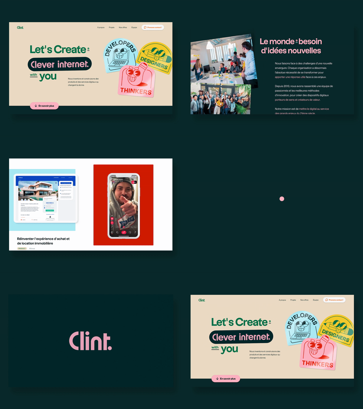

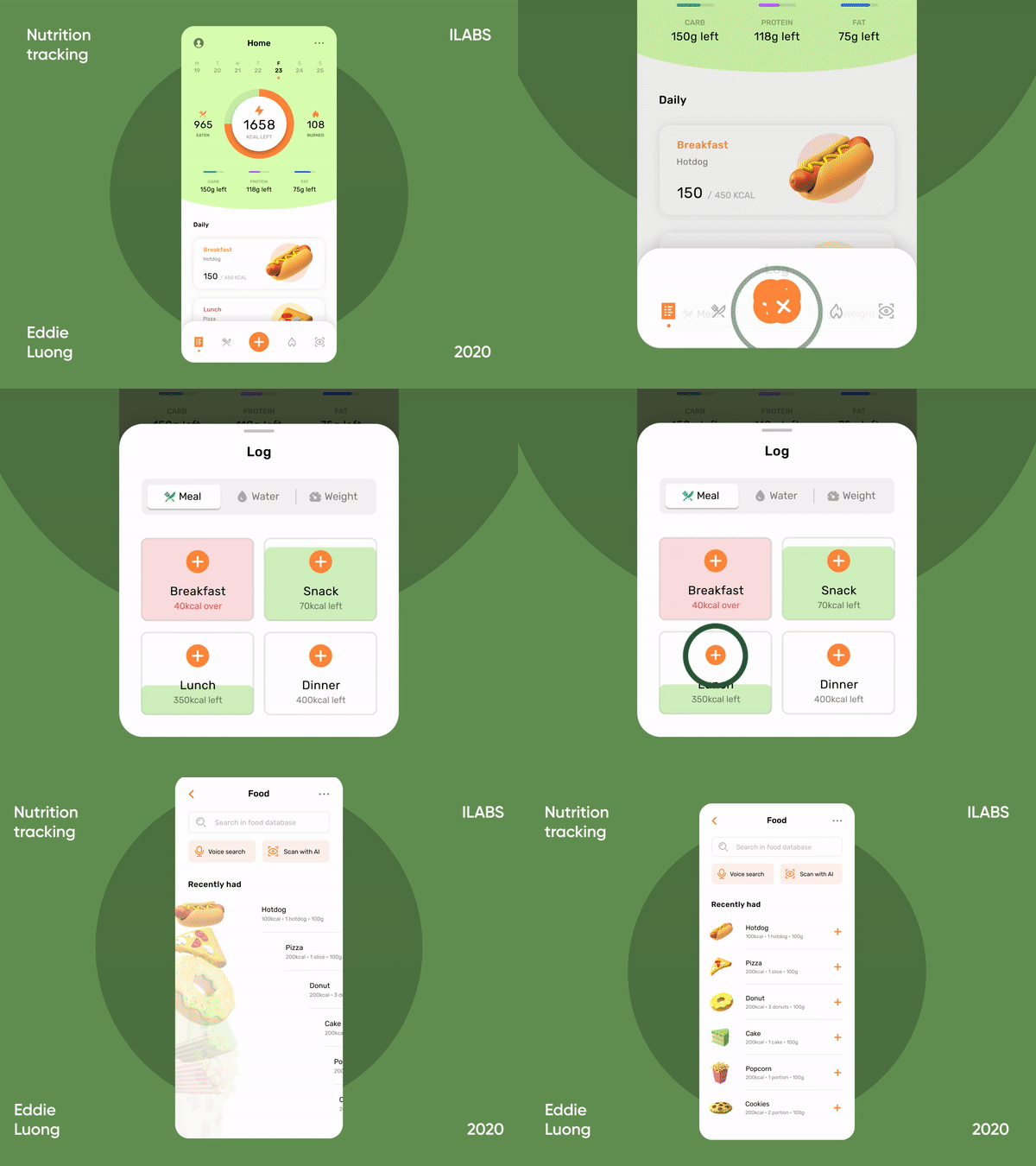
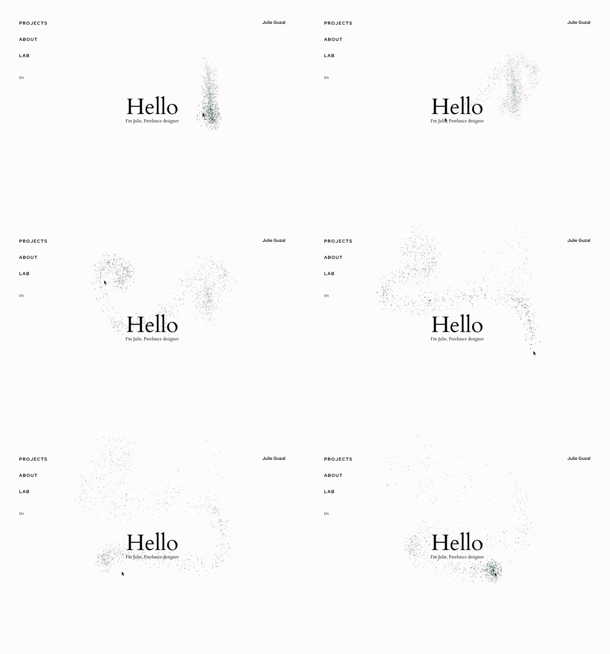
Any motion effect can tell a brand story much better than a static image or plain text. With its help, you can add a relaxing element to the most serious-themed websites, releasing users’ tension, prepared to process large volumes of serious professional information. For example, there are more motion elements tied to the user’s scroll or to the cursor nowadays:

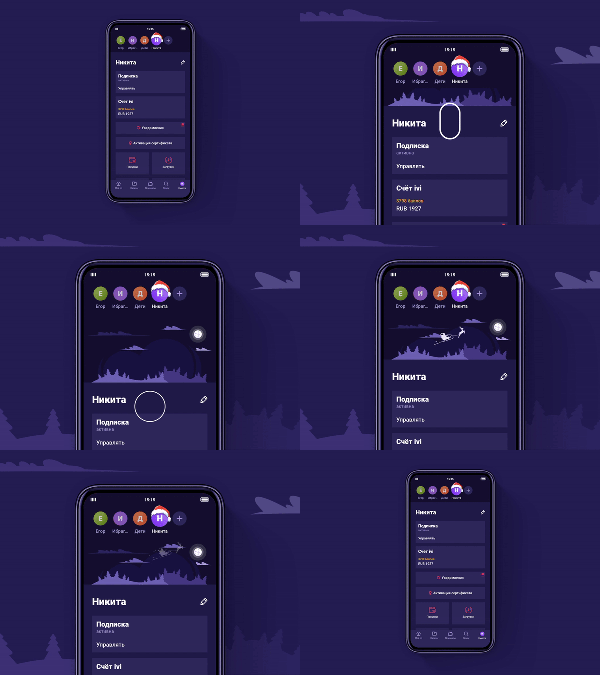
You can also entertain visitors with pull-to-refresh animations in mobile apps:

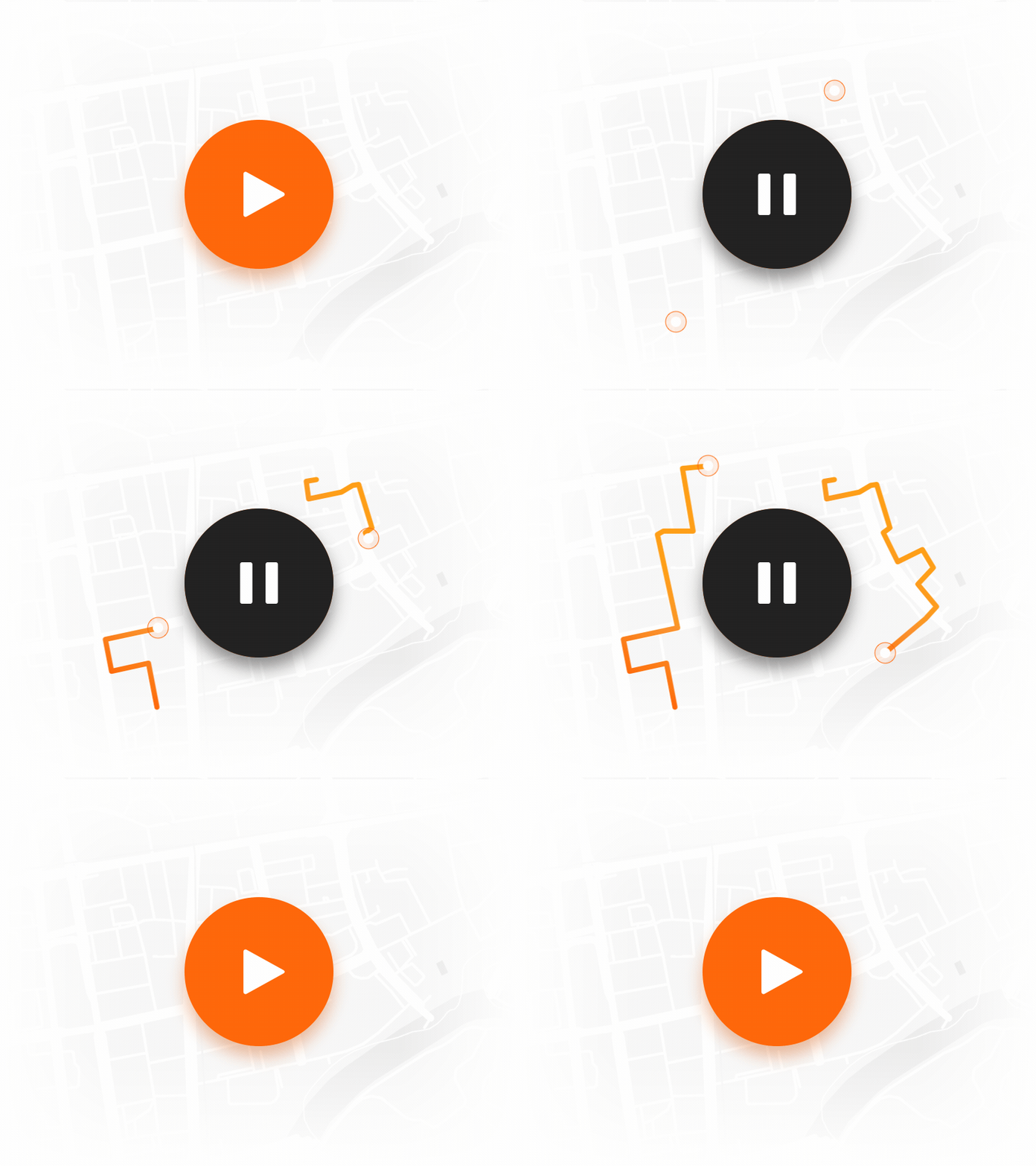
Micro-interactions are worth a separate mention. It’s more difficult nowadays to surprise someone with huge animations, so now it is more advisable to use small animated elements for user encouragement. They show state change and help users navigate. Micro-interactions are used for:
- color change for different states of the app
- website loading visualization
- animation of transitions between pages
- reaction to pressing buttons.
Expect to see more animated button experiments in 2021.

At the same time…
Animation in design should be purposeful and meaningful, i.e. not only eye-pleasing but problem-solving. The most important purpose of the animation is to explain, simplify, and speed up the interaction process, and only then create the so-called “wow effect”. Interface animation solutions should be implemented for usability reasons, not pure decoration and entertainment.
#7 Physicality and realistic textures
The title for this point might also be something like “Attempting to go away from the Flat”. The peak popularity of flat design was in 2012, though along with the minimalism, it still remains among the things that shape the modern UI design. At the same time, many designers are starting to feel the need for something new and fresh, even if only in graphics.
Although the reign of smooth and cool gradients and flat objects is in full swing, one of the trends that try to break into this sameness is the tendency to add some real-life with its uneven textures. Take a look at this book cover illustration by the Estonian illustrator and graphic designer Eiko Ojala:

And though the attempts with the neumorphism apparently didn’t work out (it never had many fans from the start), a lot of designers reach out to tangible aesthetics that lend a more authentic feel and sincerity.

The visitors have the impression that they can almost touch the products with their hands thanks to realistic textures. This creates a feeling of connection between customers and products. This tendency to add realistic textures, grains, and contours is also very present in the modern UI design and has great potential for further development in 2021. It’s used in photos and multimedia and can be pleasant to the human eye and play into the hands of those companies who sell products like furniture or cosmetics.

At the same time…
The desire of entire brands to use craft elements on their webpages, whether it’s graphics, special fonts, textures, or grainy effects is understandable. The interface becomes more human, which helps in the promotion of companies that wish to emphasize their focus on caring for people. And yet, while this physicality is great for conveying the feel of physical objects, it’s important for a designer to not overdo it to the point where it would distract a user from the main goal — making a purchase.
#8 From perfection to uniqueness
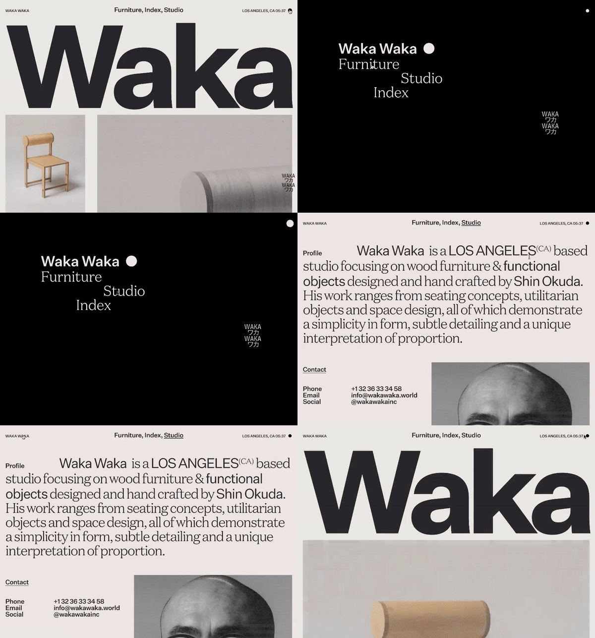
In recent years the focus of many websites has been on the perfect design where everything is well thought out and precise. This trend is likely to change in 2021 because a unique design is becoming increasingly more important. In fact, the trend is with designs that look “incomplete”, as 2020 has shown us already. However, the main idea is that designers can make this incompleteness look professional and create a unique appeal with the help of familiar elements, differently arranged and presented.
Unorthodox layouts
In the world of UI/UX design, symmetry primarily stands for classic and conventional designs. This is a great approach to help streamline the structure of a website. Then again, all sites built on grids look very similar to each other. And a decrease in the uniqueness affects both the website promotion in search engines and the ability to stand out from competitors. Unorthodox and creative layouts will be more prominent in 2021. This allows you to give your website more character and personality and emphasize its particularly important areas.
Unorthodox scroll
It helps to use new, interesting, and non-standard solutions and methods. Creative navigation techniques include horizontal navigation slideshows, scroll color fade, mixing horizontal and vertical scroll, scroll-triggered animation, drag to explore, etc. Such solutions are especially great for promotional sites about creative collaborations and events.
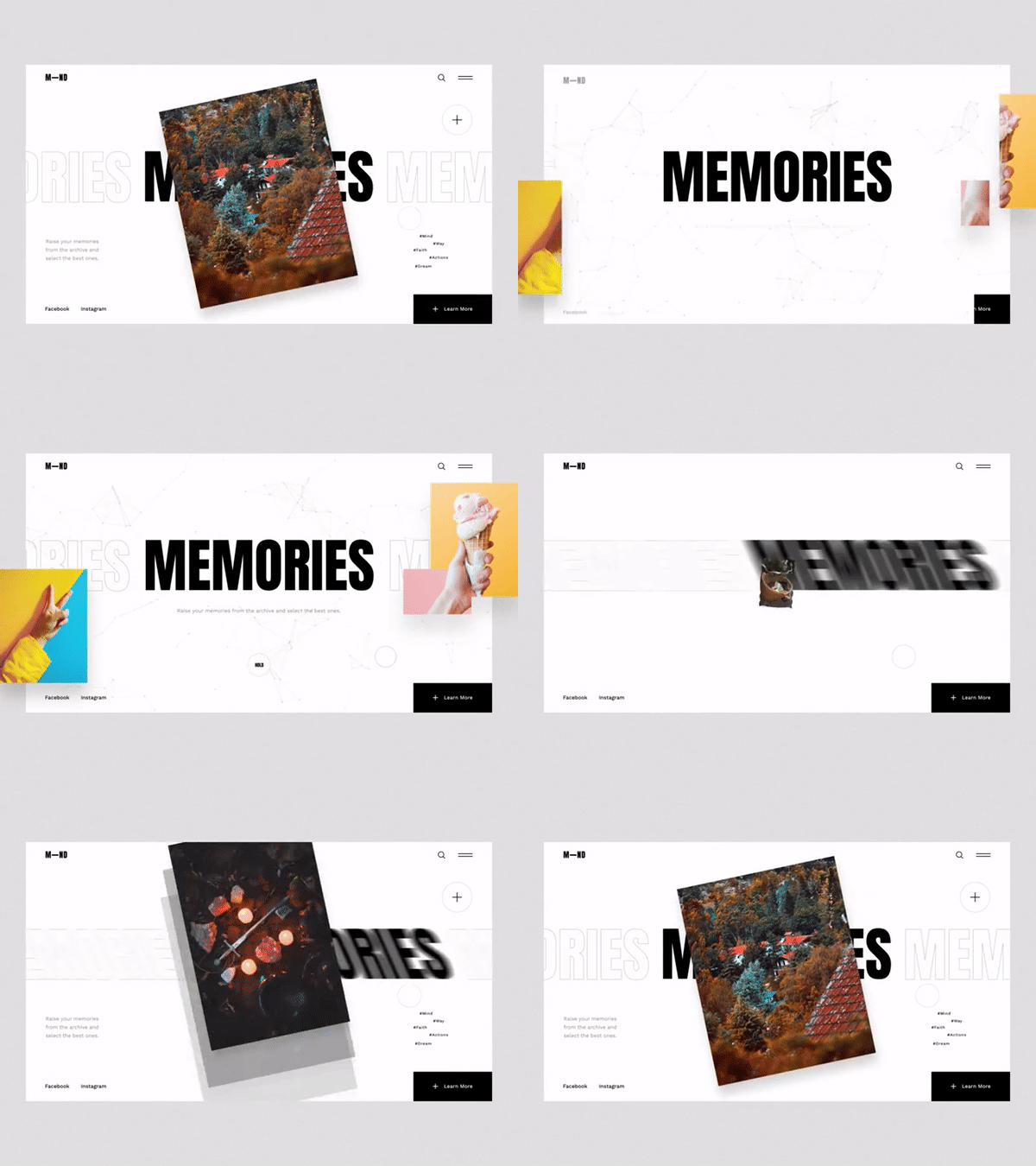
Color combinations
Don’t shy away from neon colors, retro aesthetics, and unique designs, because the main thing is to completely differentiate yourself from the competition with the help of UI design.


Typography
Why not try to make your design unique with the help of typography?

At the same time…
The only caveat is that however cool and unique such solutions are, what makes them unique is what also makes them inappropriate for the variety of more “down-to-earth” projects. They are not suitable for interfaces where the customer must focus on important data, such as industrial device interfaces, or for projects intended for a very wide audience like conventional online stores. It’s suitable only when it doesn’t annoy a user but arouses their interest, pleasantly surprises, and evokes admiration. Balance, brevity, and relevance.
#9 Super tech landing pages
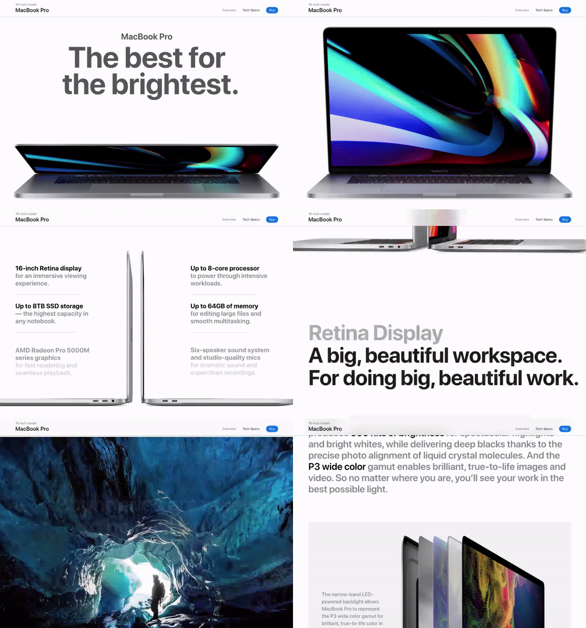
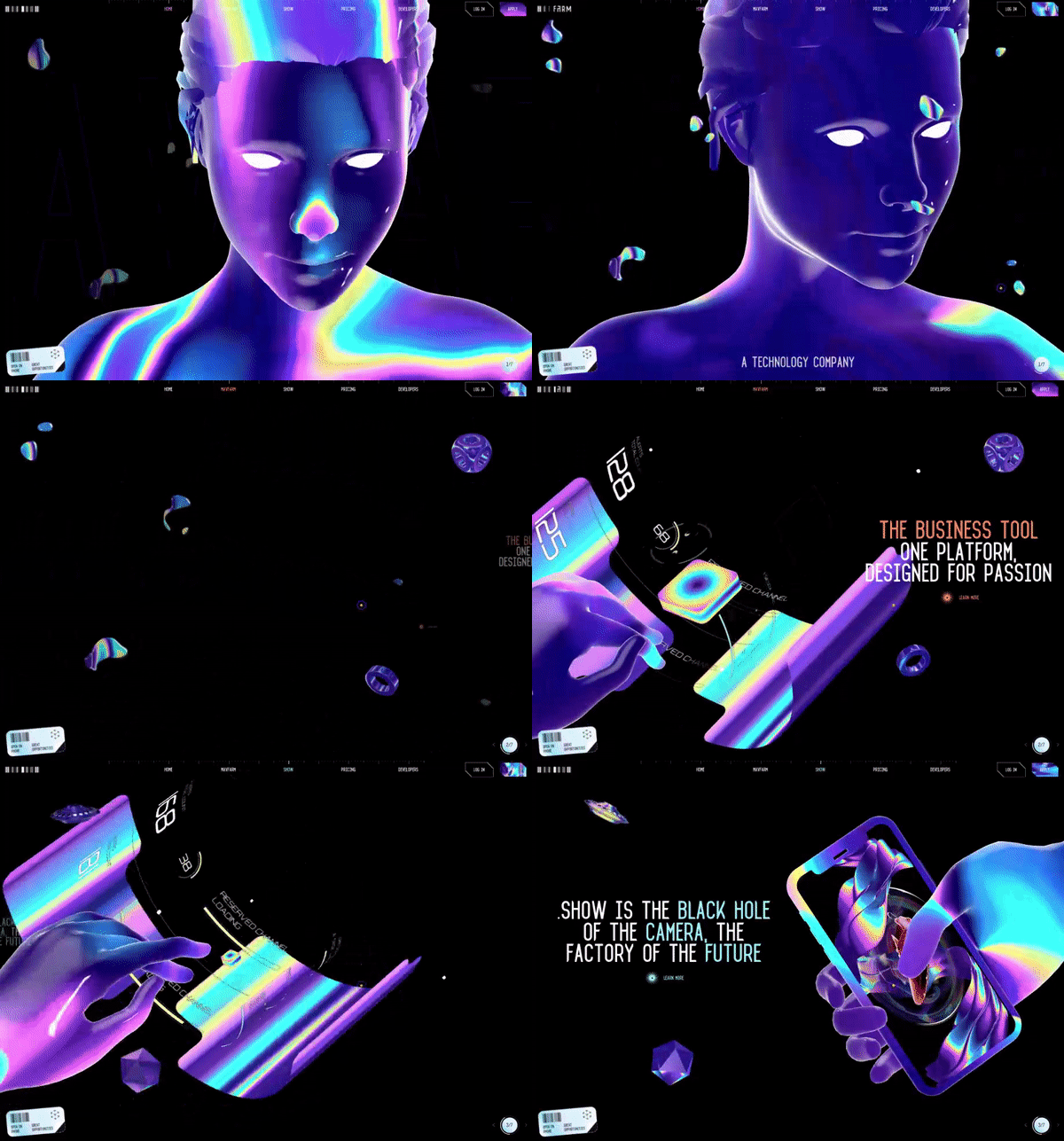
There is also a trend that involves especially complex work with layouts and animation. An abstract representation of products and processes is a perfect solution for the tech- and production-oriented websites that can’t afford to lose visitors who get bored. These tricks include hyper-realistic complex animations, renders, and volumetric illustrations that attract, amaze, and captivate.
The result may be of various degrees of “incredibleness”. Sometimes these are just detailed, stylish but rather neutral examples like this MacBook Pro landing page:

Other examples can be breathtaking:

At the same time…
The visuals are stunning. They truly are. And the level of engineering and design work put into creating these pages is apparent. The main challenge though is that at the best of times visitors get no more than 60% of the information you are trying to convey by a website. With these websites, they get about 10%. To the point when this trend makes designers violate the very idea of accessible and clear delivery of information in the pursuit of pleasing you with jaw-dropping visuals. Find the golden mean where you can simultaneously astonish and bring value.
#10 Unusual illustrations and SVGs
3D is also still popular in illustrations, as well as 2Ds with unusual angles, experiments with proportions, surreal plots, vivid or, by contrast, vintage-muted colors. If before minimalism ruled in illustrations also, now the grotesque style is very popular, based on quirkiness and a combination of the real and the unreal.

Another highlight is vector illustrations in SVG (Scalable Vector Graphics) format that uses XML to define basic properties such as paths, shapes, fonts, and colors, and more advanced features.
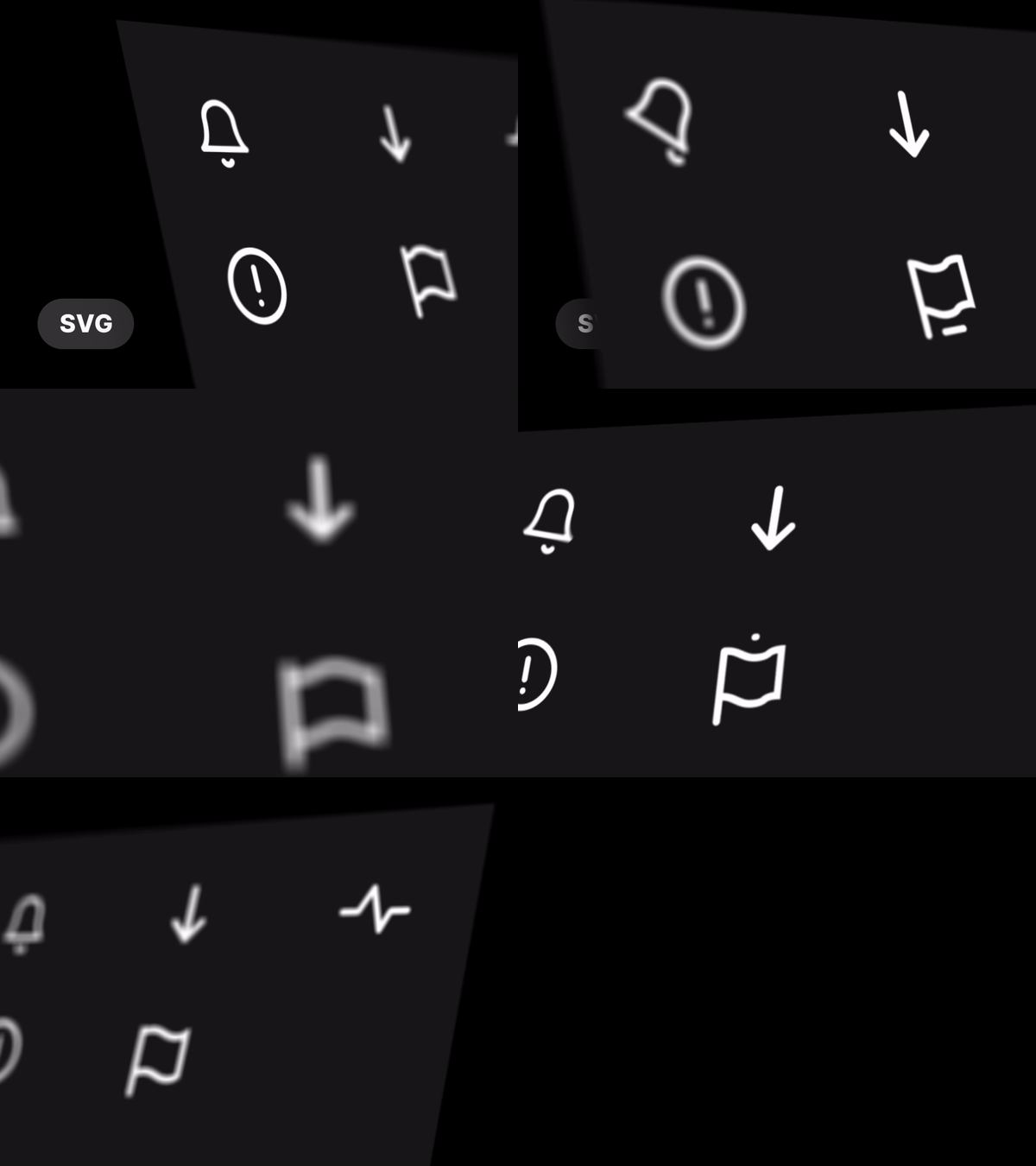

The thing is, PNGs, GIFs, and JPEGs lose their quality when the display resolution is increased. That’s why you have to keep a separate file for each type of screen. With SVGs, there is no such problem, since the vector format can be enlarged and reduced without loss of quality.
At the same time…
Confronting powerful information flows with only the stock photo content seems to be a rather difficult task. Thus, illustrations are an obvious solution to catch the users’ eye and stand against the mainstream market background. It can become your style. At the same time, this style of illustration is not suitable everywhere. If you know that your audience would rather be put off by such experiments instead of becoming attracted, it might be better to choose something more safe and save your rad ideas for other places and purposes.
#11 Further UX simplification
There is an ongoing optimization towards one-step action. The designer’s task is to cut down the elements and fields that need filling out to the minimum. The same applies to the number of steps a user has to take to reach the desired result. One of the latest UX trends, for example, is placing the whole checkout in a single step.
Registration and log-in processes are getting simplified or become a side step in the user flow. In 2021, don’t force users to remember their passwords. For instance, in an online store, the user’s personal identifier can be their phone number or biometric data.
Apple introduced its super-button, which substitutes random data for registration. In many applications, you can now register with only one button without the involvement of social networks.

At the same time…
Respect your users’ neural connections. Are they ready for your new simplified flow?
Take into account the niche in which the business operates and your target audience. Test your ideas first. Even when the general concept is correct, you can still find many minor flaws just by listening to your test audience, especially users with little experience. In the era of depleted attention resources, when the abundance of interfaces turns into a visually uniform “mess”, an unusual UX can become irritating.
#12 The era of super apps
For the past 20 years, the model coming out of Silicon Valley has been the “single purpose” apps. But today the so-called “Super apps” are insanely popular in China and the neighboring countries. Still, they are almost uncommon to Western consumers.
Super apps combine many services and try to solve any problem a user has. An application like this can combine such functions as a social network, messenger, game, dating, marketplace, money transferring, currency exchange, insurance, food delivery, taxi, hotel booking, and much more. In China, the most striking examples of super apps are WeChat and AliPay, each of which is used by more than a billion people every month, which is, in fact, the entire socially active part of the country’s population.
Companies need super apps to compete for users. They strive to create ecosystems that cover all needs and which you don’t have to leave at all. The more time a user spends in an app, the higher the loyalty that can be then monetized.

Last summer, Russia’s leading tech company, Yandex, announced the launch of Yandex Go, the first European super app that combines aspects of on-demand transportation and delivery. Amazon, Facebook, and Google all have active super app-like products in Asia to compete with the local products. If Chinese companies continue to play an increasingly influential role in tech, our online world could look very different in the next few years.
At the same time…
Many people don’t find it useful when there are too many functions in their apps. It becomes tricky and irritating to get through the mass of services to quickly find what you need at the moment.
Another thing is that the Asian people seem to be less reluctant to have a provider or a service imposed on them as a part of a super app “package”. Meanwhile, Westerners are more likely to explore several options before buying, that’s why as of now they are more inclined to use a variety of single-purpose apps.
#13 Advanced onboardings
No better time but 2020 to fully appreciate the power of good onboarding when millions of people were forced to deal with the task of installing and using video conferencing and similar remote-work services.
The major functions of onboardings include:
- familiarizing a user about the app’s major functions and purposes
- giving the opportunity to sign-up
- collecting information to improve personalization.
Modern onboardings are making the list of the most important mobile app screens going beyond the mere explanation of the interface elements to presenting the product itself.

At the same time…
Many people think that onboardings are inherently a sign of a bad design. That is, if you have to explain something, then you didn’t do a good enough job designing it. On the other hand, if users don’t understand your app, they’re not going to use it. An effective onboarding makes sure that visitors get the right idea about what an app can do and impresses users from the get-go. Use custom graphics to make the app recognizable and pay close attention to copy: make it clear, concise, and easily readable.
#14 Always trending: Critical thinking and design relevance
Design is cyclical. New trends in UI/UX design come every year, so there will be a lot of repetitions, and a lot of things from the past will be back. Like some predict the return of the Bauhaus in 3–4 years. Other designers and studios are in search of a new approach to replace the Flat.
After all that has been said above, it remains to highlight a UI/UX design trend that will never go out of fashion — critical thinking and design relevance. That is, if something is a trend in design, then it has the right to live, its own logic and development perspective. Design is a means, not an end. There must be something else behind it. Design is a visual language with which you communicate a product’s value. When you know the language, you want to create something worthwhile with it. The same is with design.
Originally published at https://shakuro.com.





Comments